Computing prediction intervals using quantile regression#
Environment setup#
We need to install some extra dependencies for this notebook if needed (when running jupyterlite).
%pip install -q https://pypi.anaconda.org/ogrisel/simple/polars/1.24.0/polars-1.24.0-cp39-abi3-emscripten_3_1_58_wasm32.whl
%pip install -q skrub altair holidays plotly nbformat
ERROR: polars-1.24.0-cp39-abi3-emscripten_3_1_58_wasm32.whl is not a supported wheel on this platform.
Note: you may need to restart the kernel to use updated packages.
Note: you may need to restart the kernel to use updated packages.
import warnings
import altair
import cloudpickle
import numpy as np
import pyarrow # noqa: F401
import polars as pl
import tzdata # noqa: F401
from tutorial_helpers import (
binned_coverage,
plot_lorenz_curve,
plot_reliability_diagram,
plot_residuals_vs_predicted,
collect_cv_predictions,
)
# Ignore warnings from pkg_resources triggered by Python 3.13's multiprocessing.
warnings.filterwarnings("ignore", category=UserWarning, module="pkg_resources")
with open("feature_engineering_pipeline.pkl", "rb") as f:
feature_engineering_pipeline = cloudpickle.load(f)
features = feature_engineering_pipeline["features"]
targets = feature_engineering_pipeline["targets"]
prediction_time = feature_engineering_pipeline["prediction_time"]
horizons = feature_engineering_pipeline["horizons"]
target_column_name_pattern = feature_engineering_pipeline["target_column_name_pattern"]
Define the quantile regressors#
In this section, we show how one can use a gradient boosting but modify the loss function to predict different quantiles and thus obtain an uncertainty quantification of the predictions.
In terms of evaluation, we reuse the R2 and MAPE scores. However, they are not helpful to assess the reliability of quantile models. For this purpose, we use a derivate of the metric minimize by those models: the pinball loss. We use the D2 score that is easier to interpret since the best possible score is bounded by 1 and a score of 0 corresponds to constant predictions at the target quantile.
horizon_of_interest = horizons[-1] # Focus on the 24-hour horizon
target_column_name = target_column_name_pattern.format(horizon=horizon_of_interest)
predicted_target_column_name = "predicted_" + target_column_name
target = targets[target_column_name].skb.mark_as_y()
target
Show graph
| load_mw_horizon_24h |
|---|
| 4.45e+04 |
| 4.24e+04 |
| 4.16e+04 |
| 4.36e+04 |
| 4.86e+04 |
| 5.25e+04 |
| 5.08e+04 |
| 4.90e+04 |
| 4.77e+04 |
| 4.69e+04 |
load_mw_horizon_24h
Float64- Null values
- 0 (0.0%)
- Unique values
-
966 (96.6%)
This column has a high cardinality (> 40).
- Mean ± Std
- 5.07e+04 ± 6.38e+03
- Median ± IQR
- 5.05e+04 ± 8.44e+03
- Min | Max
- 3.35e+04 | 6.95e+04
No columns match the selected filter: . You can change the column filter in the dropdown menu above.
| Column | Column name | dtype | Is sorted | Null values | Unique values | Mean | Std | Min | Median | Max |
|---|---|---|---|---|---|---|---|---|---|---|
| 0 | load_mw_horizon_24h | Float64 | False | 0 (0.0%) | 966 (96.6%) | 5.07e+04 | 6.38e+03 | 3.35e+04 | 5.05e+04 | 6.95e+04 |
No columns match the selected filter: . You can change the column filter in the dropdown menu above.
Please enable javascript
The skrub table reports need javascript to display correctly. If you are displaying a report in a Jupyter notebook and you see this message, you may need to re-execute the cell or to trust the notebook (button on the top right or "File > Trust notebook").
from sklearn.metrics import get_scorer, make_scorer
from sklearn.metrics import mean_absolute_percentage_error, d2_pinball_score
scoring = {
"r2": get_scorer("r2"),
"mape": make_scorer(mean_absolute_percentage_error),
"d2_pinball_05": make_scorer(d2_pinball_score, alpha=0.05),
"d2_pinball_50": make_scorer(d2_pinball_score, alpha=0.50),
"d2_pinball_95": make_scorer(d2_pinball_score, alpha=0.95),
}
We know define three different models:
a model predicting the 5th percentile of the load
a model predicting the median of the load
a model predicting the 95th percentile of the load
from sklearn.ensemble import HistGradientBoostingRegressor
common_params = dict(
loss="quantile", learning_rate=0.1, max_leaf_nodes=100, random_state=0
)
predictions_hgbr_05 = features.skb.apply(
HistGradientBoostingRegressor(**common_params, quantile=0.05),
y=target,
)
predictions_hgbr_50 = features.skb.apply(
HistGradientBoostingRegressor(**common_params, quantile=0.5),
y=target,
)
predictions_hgbr_95 = features.skb.apply(
HistGradientBoostingRegressor(**common_params, quantile=0.95),
y=target,
)
Evaluation via cross-validation#
We evaluate the performance of the quantile regressors via cross-validation.
from sklearn.model_selection import TimeSeriesSplit
max_train_size = 2 * 52 * 24 * 7 # max ~2 years of training data
test_size = 24 * 7 * 24 # 24 weeks of test data
gap = 7 * 24 # 1 week gap between train and test sets
ts_cv_5 = TimeSeriesSplit(
n_splits=5, max_train_size=max_train_size, test_size=test_size, gap=gap
)
cv_results_hgbr_05 = predictions_hgbr_05.skb.cross_validate(
cv=ts_cv_5,
scoring=scoring,
return_learner=True,
verbose=1,
n_jobs=-1,
)
cv_results_hgbr_50 = predictions_hgbr_50.skb.cross_validate(
cv=ts_cv_5,
scoring=scoring,
return_learner=True,
verbose=1,
n_jobs=-1,
)
cv_results_hgbr_95 = predictions_hgbr_95.skb.cross_validate(
cv=ts_cv_5,
scoring=scoring,
return_learner=True,
verbose=1,
n_jobs=-1,
)
[Parallel(n_jobs=-1)]: Using backend LokyBackend with 4 concurrent workers.
[Parallel(n_jobs=-1)]: Done 5 out of 5 | elapsed: 12.8s finished
[Parallel(n_jobs=-1)]: Using backend LokyBackend with 4 concurrent workers.
[Parallel(n_jobs=-1)]: Done 5 out of 5 | elapsed: 12.4s finished
[Parallel(n_jobs=-1)]: Using backend LokyBackend with 4 concurrent workers.
[Parallel(n_jobs=-1)]: Done 5 out of 5 | elapsed: 9.8s finished
Let’s first collect all the cross-validated predictions to make further inspection.
cv_predictions_hgbr_05 = collect_cv_predictions(
cv_results_hgbr_05["learner"], ts_cv_5, predictions_hgbr_05, prediction_time
)
cv_predictions_hgbr_50 = collect_cv_predictions(
cv_results_hgbr_50["learner"], ts_cv_5, predictions_hgbr_50, prediction_time
)
cv_predictions_hgbr_95 = collect_cv_predictions(
cv_results_hgbr_95["learner"], ts_cv_5, predictions_hgbr_95, prediction_time
)
Now, let’s make a plot of the predictions for each model and thus we need to gather all the predictions in a single dataframe.
results = pl.concat(
[
cv_predictions_hgbr_05[0].rename({"predicted_load_mw": "predicted_load_mw_05"}),
cv_predictions_hgbr_50[0].select("predicted_load_mw").rename(
{"predicted_load_mw": "predicted_load_mw_50"}
),
cv_predictions_hgbr_95[0].select("predicted_load_mw").rename(
{"predicted_load_mw": "predicted_load_mw_95"}
),
],
how="horizontal",
).tail(24 * 10)
Now, we plot the observed values and the predicted median with a line. In addition, we plot the 5th and 95th percentiles as a shaded area. It means that between those two bounds, we expect to find 90% of the observed values.
We plot this information on a portion of the test data from the first fold of the cross-validation.
median_chart = (
altair.Chart(results)
.transform_fold(["load_mw", "predicted_load_mw_50"])
.mark_line(tooltip=True)
.encode(x="prediction_time:T", y="value:Q", color="key:N")
)
# Add a column for the band legend
results_with_band = results.with_columns(pl.lit("90% interval").alias("band_type"))
quantile_band_chart = (
altair.Chart(results_with_band)
.mark_area(opacity=0.4, tooltip=True)
.encode(
x="prediction_time:T",
y="predicted_load_mw_05:Q",
y2="predicted_load_mw_95:Q",
color=altair.Color("band_type:N", scale=altair.Scale(range=["lightgreen"])),
)
)
combined_chart = quantile_band_chart + median_chart
combined_chart.resolve_scale(color="independent").interactive()
Now, we can inspect the cross-validated metrics for each model.
cv_results_hgbr_05[
[col for col in cv_results_hgbr_05.columns if col.startswith("test_")]
].mean(axis=0).round(3)
test_r2 0.853
test_mape 0.051
test_d2_pinball_05 0.698
test_d2_pinball_50 0.644
test_d2_pinball_95 -1.250
dtype: float64
cv_results_hgbr_50[
[col for col in cv_results_hgbr_50.columns if col.startswith("test_")]
].mean(axis=0).round(3)
test_r2 0.970
test_mape 0.024
test_d2_pinball_05 0.180
test_d2_pinball_50 0.841
test_d2_pinball_95 0.494
dtype: float64
cv_results_hgbr_95[
[col for col in cv_results_hgbr_95.columns if col.startswith("test_")]
].mean(axis=0).round(3)
test_r2 0.848
test_mape 0.064
test_d2_pinball_05 -2.392
test_d2_pinball_50 0.611
test_d2_pinball_95 0.775
dtype: float64
Focusing on the different D2 scores, we observe that each model minimize the D2 score
associated to the target quantile that we set. For instance, the model predicting the
5th percentile obtained the highest D2 pinball score with alpha=0.05. It is expected
but a confirmation of what loss each model minimizes.
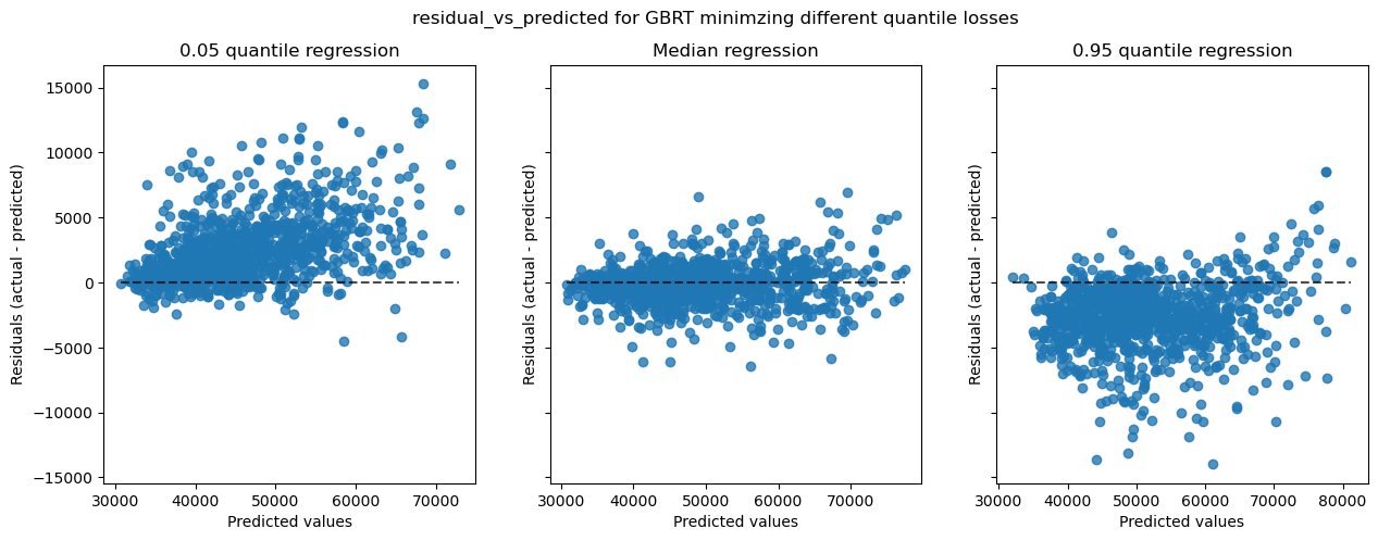
Now, let’s collect the cross-validated predictions and plot the residual vs predicted values for the different models.
plot_residuals_vs_predicted(cv_predictions_hgbr_05).interactive().properties(
title=(
"Residuals vs Predicted Values from cross-validation predictions"
" for quantile 0.05"
)
)
plot_residuals_vs_predicted(cv_predictions_hgbr_50).interactive().properties(
title=("Residuals vs Predicted Values from cross-validation predictions for median")
)
plot_residuals_vs_predicted(cv_predictions_hgbr_95).interactive().properties(
title=(
"Residuals vs Predicted Values from cross-validation predictions"
" for quantile 0.95"
)
)
We observe an expected behaviour: the residuals are centered and symmetric around 0 for the median model while not centered and biased for the 5th and 95th percentiles models.
Note that we could obtain similar plots using scikit-learn’s PredictionErrorDisplay.
This display allows to also plot the observed values vs predicted values as well.
cv_predictions_hgbr_05_concat = pl.concat(cv_predictions_hgbr_05, how="vertical")
cv_predictions_hgbr_50_concat = pl.concat(cv_predictions_hgbr_50, how="vertical")
cv_predictions_hgbr_95_concat = pl.concat(cv_predictions_hgbr_95, how="vertical")
import matplotlib.pyplot as plt
from sklearn.metrics import PredictionErrorDisplay
for kind in ["actual_vs_predicted", "residual_vs_predicted"]:
fig, axs = plt.subplots(1, 3, figsize=(15, 5), sharey=True)
PredictionErrorDisplay.from_predictions(
y_true=cv_predictions_hgbr_05_concat["load_mw"].to_numpy(),
y_pred=cv_predictions_hgbr_05_concat["predicted_load_mw"].to_numpy(),
kind=kind,
ax=axs[0],
)
axs[0].set_title("0.05 quantile regression")
PredictionErrorDisplay.from_predictions(
y_true=cv_predictions_hgbr_50_concat["load_mw"].to_numpy(),
y_pred=cv_predictions_hgbr_50_concat["predicted_load_mw"].to_numpy(),
kind=kind,
ax=axs[1],
)
axs[1].set_title("Median regression")
PredictionErrorDisplay.from_predictions(
y_true=cv_predictions_hgbr_95_concat["load_mw"].to_numpy(),
y_pred=cv_predictions_hgbr_95_concat["predicted_load_mw"].to_numpy(),
kind=kind,
ax=axs[2],
)
axs[2].set_title("0.95 quantile regression")
fig.suptitle(f"{kind} for GBRT minimzing different quantile losses")
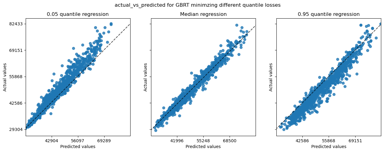
Those plots carry the same information than the previous ones.
Now, we assess if the actual coverage of the models is close to the target coverage of 90%. In addition, we compute the average width of the bands.
def coverage(y_true, y_quantile_low, y_quantile_high):
y_true = np.asarray(y_true)
y_quantile_low = np.asarray(y_quantile_low)
y_quantile_high = np.asarray(y_quantile_high)
return float(
np.logical_and(y_true >= y_quantile_low, y_true <= y_quantile_high)
.mean()
.round(4)
)
def mean_width(y_true, y_quantile_low, y_quantile_high):
y_true = np.asarray(y_true)
y_quantile_low = np.asarray(y_quantile_low)
y_quantile_high = np.asarray(y_quantile_high)
return float(np.abs(y_quantile_high - y_quantile_low).mean().round(1))
coverage(
cv_predictions_hgbr_50_concat["load_mw"].to_numpy(),
cv_predictions_hgbr_05_concat["predicted_load_mw"].to_numpy(),
cv_predictions_hgbr_95_concat["predicted_load_mw"].to_numpy(),
)
0.7657
We see that the obtained coverage (~77%) on the cross-validated predictions is much lower than the target coverage of 90%. It means that the pair of regressors is not jointly calibrated to estimate the 90% interval.
mean_width(
cv_predictions_hgbr_50_concat["load_mw"].to_numpy(),
cv_predictions_hgbr_05_concat["predicted_load_mw"].to_numpy(),
cv_predictions_hgbr_95_concat["predicted_load_mw"].to_numpy(),
)
5144.7
In terms of interpretable measure, the mean width provides a measure in the original unit of the target variable in MW that is ~5,100 MW.
We can go a bit further and bin the cross-validated predictions and check if some specific bins show a better or worse coverage.
binned_coverage_results = binned_coverage(
[df["load_mw"].to_numpy() for df in cv_predictions_hgbr_50],
[df["predicted_load_mw"].to_numpy() for df in cv_predictions_hgbr_05],
[df["predicted_load_mw"].to_numpy() for df in cv_predictions_hgbr_95],
n_bins=10,
)
binned_coverage_results
| bin_left | bin_right | bin_center | fold_idx | coverage | mean_width | n_samples | |
|---|---|---|---|---|---|---|---|
| 0 | 28744.0 | 36884.0 | 32814.0 | 0 | 0.4205 | 4235.5 | 459 |
| 1 | 36886.0 | 40158.0 | 38522.0 | 0 | 0.6493 | 4291.2 | 499 |
| 2 | 40160.0 | 42982.0 | 41571.0 | 0 | 0.7117 | 4501.7 | 496 |
| 3 | 42983.0 | 45219.0 | 44101.0 | 0 | 0.7400 | 4281.1 | 473 |
| 4 | 45220.0 | 47332.0 | 46276.0 | 0 | 0.7401 | 4071.5 | 454 |
| 5 | 47334.0 | 49718.0 | 48526.0 | 0 | 0.7044 | 3868.6 | 477 |
| 6 | 49720.0 | 53126.0 | 51423.0 | 0 | 0.7418 | 4679.3 | 426 |
| 7 | 53129.0 | 57570.0 | 55349.5 | 0 | 0.8162 | 6144.5 | 321 |
| 8 | 57572.0 | 63173.0 | 60372.5 | 0 | 0.8687 | 7106.8 | 259 |
| 9 | 63176.0 | 86573.0 | 74874.5 | 0 | 0.8929 | 8807.9 | 168 |
| 10 | 28744.0 | 36884.0 | 32814.0 | 1 | 0.4637 | 3917.9 | 496 |
| 11 | 36886.0 | 40158.0 | 38522.0 | 1 | 0.7960 | 4557.4 | 402 |
| 12 | 40160.0 | 42982.0 | 41571.0 | 1 | 0.8550 | 4842.4 | 407 |
| 13 | 42983.0 | 45219.0 | 44101.0 | 1 | 0.8783 | 4546.3 | 378 |
| 14 | 45220.0 | 47332.0 | 46276.0 | 1 | 0.8939 | 4620.4 | 377 |
| 15 | 47334.0 | 49718.0 | 48526.0 | 1 | 0.8648 | 5101.1 | 392 |
| 16 | 49720.0 | 53126.0 | 51423.0 | 1 | 0.8450 | 5774.8 | 400 |
| 17 | 53129.0 | 57570.0 | 55349.5 | 1 | 0.8657 | 6392.7 | 402 |
| 18 | 57572.0 | 63173.0 | 60372.5 | 1 | 0.8005 | 6515.6 | 386 |
| 19 | 63176.0 | 86573.0 | 74874.5 | 1 | 0.6505 | 7550.9 | 392 |
| 20 | 28744.0 | 36884.0 | 32814.0 | 2 | 0.6887 | 4985.7 | 318 |
| 21 | 36886.0 | 40158.0 | 38522.0 | 2 | 0.7657 | 5111.9 | 367 |
| 22 | 40160.0 | 42982.0 | 41571.0 | 2 | 0.7731 | 5186.4 | 357 |
| 23 | 42983.0 | 45219.0 | 44101.0 | 2 | 0.8050 | 4952.7 | 400 |
| 24 | 45220.0 | 47332.0 | 46276.0 | 2 | 0.8814 | 4906.7 | 413 |
| 25 | 47334.0 | 49718.0 | 48526.0 | 2 | 0.8951 | 4984.1 | 410 |
| 26 | 49720.0 | 53126.0 | 51423.0 | 2 | 0.8716 | 5976.0 | 475 |
| 27 | 53129.0 | 57570.0 | 55349.5 | 2 | 0.8577 | 6568.6 | 534 |
| 28 | 57572.0 | 63173.0 | 60372.5 | 2 | 0.8386 | 6386.9 | 446 |
| 29 | 63176.0 | 86573.0 | 74874.5 | 2 | 0.6731 | 7098.5 | 312 |
| 30 | 28744.0 | 36884.0 | 32814.0 | 3 | 0.7563 | 4199.4 | 513 |
| 31 | 36886.0 | 40158.0 | 38522.0 | 3 | 0.8534 | 3682.2 | 498 |
| 32 | 40160.0 | 42982.0 | 41571.0 | 3 | 0.8358 | 3972.7 | 481 |
| 33 | 42983.0 | 45219.0 | 44101.0 | 3 | 0.8337 | 3750.7 | 457 |
| 34 | 45220.0 | 47332.0 | 46276.0 | 3 | 0.8767 | 3718.1 | 511 |
| 35 | 47334.0 | 49718.0 | 48526.0 | 3 | 0.7968 | 4168.4 | 497 |
| 36 | 49720.0 | 53126.0 | 51423.0 | 3 | 0.7019 | 4535.3 | 369 |
| 37 | 53129.0 | 57570.0 | 55349.5 | 3 | 0.8386 | 5236.3 | 254 |
| 38 | 57572.0 | 63173.0 | 60372.5 | 3 | 0.7041 | 5945.4 | 267 |
| 39 | 63176.0 | 86573.0 | 74874.5 | 3 | 0.3568 | 7160.5 | 185 |
| 40 | 28744.0 | 36884.0 | 32814.0 | 4 | 0.6217 | 4230.8 | 230 |
| 41 | 36886.0 | 40158.0 | 38522.0 | 4 | 0.7570 | 4435.0 | 251 |
| 42 | 40160.0 | 42982.0 | 41571.0 | 4 | 0.8723 | 4569.2 | 274 |
| 43 | 42983.0 | 45219.0 | 44101.0 | 4 | 0.8350 | 4213.3 | 309 |
| 44 | 45220.0 | 47332.0 | 46276.0 | 4 | 0.8385 | 4167.3 | 260 |
| 45 | 47334.0 | 49718.0 | 48526.0 | 4 | 0.7137 | 4547.9 | 241 |
| 46 | 49720.0 | 53126.0 | 51423.0 | 4 | 0.8324 | 5691.7 | 346 |
| 47 | 53129.0 | 57570.0 | 55349.5 | 4 | 0.8591 | 6481.9 | 504 |
| 48 | 57572.0 | 63173.0 | 60372.5 | 4 | 0.7857 | 6359.0 | 658 |
| 49 | 63176.0 | 86573.0 | 74874.5 | 4 | 0.5495 | 6589.4 | 959 |
Let’s make a plot to check those data visually.
coverage_by_bin = binned_coverage_results.copy()
coverage_by_bin["bin_label"] = coverage_by_bin.apply(
lambda row: f"[{row.bin_left:.0f}, {row.bin_right:.0f}]", axis=1
)
ax = coverage_by_bin.boxplot(column="coverage", by="bin_label", whis=1000)
ax.axhline(y=0.9, color="red", linestyle="--", label="Target coverage (0.9)")
ax.set(
xlabel="Load bins (MW)",
ylabel="Coverage",
title="Coverage Distribution by Load Bins",
)
ax.set_title("Coverage Distribution by Load Bins")
ax.legend()
plt.suptitle("") # Remove automatic suptitle from boxplot
_ = plt.xticks(rotation=45)
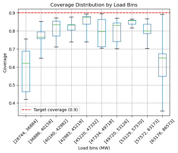
We observe that the lower and higher bins, so low and high load, have the worse coverage with a high variability.
Reliability diagrams and Lorenz curves for quantile regression#
plot_reliability_diagram(
cv_predictions_hgbr_50, kind="quantile", quantile_level=0.50
).interactive().properties(
title="Reliability diagram for quantile 0.50 from cross-validation predictions"
)
plot_reliability_diagram(
cv_predictions_hgbr_05, kind="quantile", quantile_level=0.05
).interactive().properties(
title="Reliability diagram for quantile 0.05 from cross-validation predictions"
)
plot_reliability_diagram(
cv_predictions_hgbr_95, kind="quantile", quantile_level=0.95
).interactive().properties(
title="Reliability diagram for quantile 0.95 from cross-validation predictions"
)
plot_lorenz_curve(cv_predictions_hgbr_50).interactive().properties(
title="Lorenz curve for quantile 0.50 from cross-validation predictions"
)
plot_lorenz_curve(cv_predictions_hgbr_05).interactive().properties(
title="Lorenz curve for quantile 0.05 from cross-validation predictions"
)
plot_lorenz_curve(cv_predictions_hgbr_95).interactive().properties(
title="Lorenz curve for quantile 0.95 from cross-validation predictions"
)
Quantile regression as classification#
In the following, we turn a quantile regression problem for all possible quantile levels into a multiclass classification problem by discretizing the target variable into bins and interpolating the cumulative sum of the bin membership probability to estimate the CDF of the distribution of the continuous target variable conditioned on the features.
Ideally, the classifier should be efficient when trained on a large number of classes (induced by the number of bins). Therefore we use a Random Forest classifier as the default base estimator.
There are several advantages to this approach:
a single model is trained and can jointly estimate quantiles for all quantile levels (assuming a well tuned number of bins);
the quantile levels can be chosen at prediction time, which allows for a flexible quantile regression model;
in practice, the resulting predictions are often reasonably well calibrated as we will see in the reliability diagrams below.
One possible drawback is that current implementations of gradient boosting models tend to be very slow to train with a large number of classes. Random Forests are much more efficient in this case, but they do not always provide the best predictive performance. It could be the case that combining this approach with tabular neural networks can lead to competitive results.
However, the current scikit-learn API is not expressive enough to to handle the output shape of the quantile prediction function. We therefore cannot make it fit into a skrub pipeline.
from scipy.interpolate import interp1d
from sklearn.base import BaseEstimator, RegressorMixin, clone
from sklearn.utils.validation import check_is_fitted
from sklearn.ensemble import RandomForestClassifier
from sklearn.preprocessing import KBinsDiscretizer
from sklearn.utils.validation import check_consistent_length
from sklearn.utils import check_random_state
import numpy as np
class BinnedQuantileRegressor(BaseEstimator, RegressorMixin):
def __init__(
self,
estimator=None,
n_bins=100,
quantile=0.5,
random_state=None,
):
self.n_bins = n_bins
self.estimator = estimator
self.quantile = quantile
self.random_state = random_state
def fit(self, X, y):
# Lightweight input validation: most of the input validation will be
# handled by the sub estimators.
random_state = check_random_state(self.random_state)
check_consistent_length(X, y)
self.target_binner_ = KBinsDiscretizer(
n_bins=self.n_bins,
strategy="quantile",
subsample=200_000,
encode="ordinal",
quantile_method="averaged_inverted_cdf",
random_state=random_state,
)
y_binned = (
self.target_binner_.fit_transform(np.asarray(y).reshape(-1, 1))
.ravel()
.astype(np.int32)
)
# Fit the multiclass classifier to predict the binned targets from the
# training set.
if self.estimator is None:
estimator = RandomForestClassifier(random_state=random_state)
else:
estimator = clone(self.estimator)
self.estimator_ = estimator.fit(X, y_binned)
return self
def predict_quantiles(self, X, quantiles=(0.05, 0.5, 0.95)):
check_is_fitted(self, "estimator_")
edges = self.target_binner_.bin_edges_[0]
n_bins = edges.shape[0] - 1
expected_shape = (X.shape[0], n_bins)
y_proba_raw = self.estimator_.predict_proba(X)
# Some might stay empty on the training set. Typically, classifiers do
# not learn to predict an explicit 0 probability for unobserved classes
# so we have to post process their output:
if y_proba_raw.shape != expected_shape:
y_proba = np.zeros(shape=expected_shape)
y_proba[:, self.estimator_.classes_] = y_proba_raw
else:
y_proba = y_proba_raw
# Build the mapper for inverse CDF mapping, from cumulated
# probabilities to continuous prediction.
y_cdf = np.zeros(shape=(X.shape[0], edges.shape[0]))
y_cdf[:, 1:] = np.cumsum(y_proba, axis=1)
return np.asarray([interp1d(y_cdf_i, edges)(quantiles) for y_cdf_i in y_cdf])
def predict(self, X):
return self.predict_quantiles(X, quantiles=(self.quantile,)).ravel()
quantiles = (0.05, 0.5, 0.95)
bqr = BinnedQuantileRegressor(
RandomForestClassifier(
n_estimators=300,
min_samples_leaf=5,
max_features=0.2,
n_jobs=-1,
random_state=0,
),
n_bins=30,
)
bqr
BinnedQuantileRegressor(estimator=RandomForestClassifier(max_features=0.2,
min_samples_leaf=5,
n_estimators=300,
n_jobs=-1,
random_state=0),
n_bins=30)In a Jupyter environment, please rerun this cell to show the HTML representation or trust the notebook. On GitHub, the HTML representation is unable to render, please try loading this page with nbviewer.org.
Parameters
| estimator | RandomForestC...andom_state=0) | |
| n_bins | 30 | |
| quantile | 0.5 | |
| random_state | None |
RandomForestClassifier(max_features=0.2, min_samples_leaf=5, n_estimators=300,
n_jobs=-1, random_state=0)Parameters
| n_estimators | 300 | |
| criterion | 'gini' | |
| max_depth | None | |
| min_samples_split | 2 | |
| min_samples_leaf | 5 | |
| min_weight_fraction_leaf | 0.0 | |
| max_features | 0.2 | |
| max_leaf_nodes | None | |
| min_impurity_decrease | 0.0 | |
| bootstrap | True | |
| oob_score | False | |
| n_jobs | -1 | |
| random_state | 0 | |
| verbose | 0 | |
| warm_start | False | |
| class_weight | None | |
| ccp_alpha | 0.0 | |
| max_samples | None | |
| monotonic_cst | None |
from sklearn.model_selection import cross_validate
X, y = features.skb.eval(), target.skb.eval()
cv_results_bqr = cross_validate(
bqr,
X,
y,
cv=ts_cv_5,
scoring={
"d2_pinball_50": make_scorer(d2_pinball_score, alpha=0.5),
},
return_estimator=True,
return_indices=True,
verbose=1,
n_jobs=-1,
)
[Parallel(n_jobs=-1)]: Using backend LokyBackend with 4 concurrent workers.
[Parallel(n_jobs=-1)]: Done 5 out of 5 | elapsed: 2.1min finished
cv_predictions_bqr_all = [
cv_predictions_bqr_05 := [],
cv_predictions_bqr_50 := [],
cv_predictions_bqr_95 := [],
]
for fold_ix, (qreg, test_idx) in enumerate(
zip(cv_results_bqr["estimator"], cv_results_bqr["indices"]["test"])
):
print(f"CV iteration #{fold_ix}")
print(f"Test set size: {test_idx.shape[0]} rows")
print(
f"Test time range: {prediction_time.skb.eval()[test_idx][0, 0]} to "
f"{prediction_time.skb.eval()[test_idx][-1, 0]} "
)
y_pred_all_quantiles = qreg.predict_quantiles(X[test_idx], quantiles=quantiles)
coverage_score = coverage(
y[test_idx],
y_pred_all_quantiles[:, 0],
y_pred_all_quantiles[:, 2],
)
print(f"Coverage: {coverage_score:.3f}")
mean_width_score = mean_width(
y[test_idx],
y_pred_all_quantiles[:, 0],
y_pred_all_quantiles[:, 2],
)
print(f"Mean prediction interval width: " f"{mean_width_score:.1f} MW")
for q_idx, (quantile, predictions) in enumerate(
zip(quantiles, cv_predictions_bqr_all)
):
observed = y[test_idx]
predicted = y_pred_all_quantiles[:, q_idx]
predictions.append(
pl.DataFrame(
{
"prediction_time": prediction_time.skb.eval()[test_idx],
"load_mw": observed,
"predicted_load_mw": predicted,
}
)
)
print(f"d2_pinball score: {d2_pinball_score(observed, predicted):.3f}")
print()
CV iteration #0
Test set size: 4032 rows
Test time range: 2023-02-11 00:00:00+00:00 to 2023-07-28 23:00:00+00:00
Coverage: 0.965
Mean prediction interval width: 10778.0 MW
d2_pinball score: 0.346
d2_pinball score: 0.735
d2_pinball score: -0.025
CV iteration #1
Test set size: 4032 rows
Test time range: 2023-07-29 00:00:00+00:00 to 2024-01-12 23:00:00+00:00
Coverage: 0.992
Mean prediction interval width: 11109.8 MW
d2_pinball score: 0.360
d2_pinball score: 0.813
d2_pinball score: 0.275
CV iteration #2
Test set size: 4032 rows
Test time range: 2024-01-13 00:00:00+00:00 to 2024-06-28 23:00:00+00:00
Coverage: 0.988
Mean prediction interval width: 11762.3 MW
d2_pinball score: 0.292
d2_pinball score: 0.789
d2_pinball score: 0.108
CV iteration #3
Test set size: 4032 rows
Test time range: 2024-06-29 00:00:00+00:00 to 2024-12-13 23:00:00+00:00
Coverage: 0.989
Mean prediction interval width: 9291.9 MW
d2_pinball score: 0.248
d2_pinball score: 0.806
d2_pinball score: 0.316
CV iteration #4
Test set size: 4032 rows
Test time range: 2024-12-14 00:00:00+00:00 to 2025-05-30 23:00:00+00:00
Coverage: 0.978
Mean prediction interval width: 13170.0 MW
d2_pinball score: 0.349
d2_pinball score: 0.790
d2_pinball score: 0.249
# Let's assess the calibration of the quantile regression model:
plot_reliability_diagram(
cv_predictions_bqr_50, kind="quantile", quantile_level=0.50
).interactive().properties(
title="Reliability diagram for quantile 0.50 from cross-validation predictions"
)
plot_reliability_diagram(
cv_predictions_bqr_05, kind="quantile", quantile_level=0.05
).interactive().properties(
title="Reliability diagram for quantile 0.05 from cross-validation predictions"
)
plot_reliability_diagram(
cv_predictions_bqr_95, kind="quantile", quantile_level=0.95
).interactive().properties(
title="Reliability diagram for quantile 0.95 from cross-validation predictions"
)
We can complement this assessment with the Lorenz curves, which only assess the ranking power of the predictions, irrespective of their absolute values.
plot_lorenz_curve(cv_predictions_bqr_50).interactive().properties(
title="Lorenz curve for quantile 0.50 from cross-validation predictions"
)
plot_lorenz_curve(cv_predictions_bqr_05).interactive().properties(
title="Lorenz curve for quantile 0.05 from cross-validation predictions"
)
plot_lorenz_curve(cv_predictions_bqr_95).interactive().properties(
title="Lorenz curve for quantile 0.95 from cross-validation predictions"
)