What is a calibration curve?#
Before we dive into how to interpret a calibration curve, let’s start by getting intuitions on what it graphically represents. In this exercise, you will build your own calibration curve.
To simplify the process, we only focus on the output of a binary classifier but without going into details on the model used to generate the predictions. We later discuss the implications of the data modeling process on the calibration curve.
So let’s first generate some predictions. The generative process is located in the
file _generate_predictions.py. This process stores the observed labels and the
predicted probability estimates of several models into the predictions folder.
# Make sure to have scikit-learn >= 1.5
import sklearn

sklearn.__version__
'1.9.0'
# allows this file to be executed as a Python script.
from IPython import get_ipython

ipython = get_ipython()
ipython.run_line_magic("run", "../python_files/_generate_predictions.py")
Let’s load a the observed labels and the predicted probabilities of one of the models.
import numpy as np

y_observed = np.load("../predictions/y_true.npy")
y_prob = np.load("../predictions/y_prob_2.npy")
y_observed
array([0, 0, 1, ..., 0, 1, 0], shape=(50000,))
y_observed contains the observed labels. In this case, we face a binary
classification problem.
y_prob
array([0.01301041, 0.51749109, 0.73808646, ..., 0.09744258, 0.22943148,
       0.36252617], shape=(50000,))
y_prob contains the predicted probabilities of the positive class estimated
by a given model.
As discussed earlier, we could evaluate the discriminative power of the model using a metric such as the ROC-AUC score.
from sklearn.metrics import roc_auc_score

print(f"ROC AUC: {roc_auc_score(y_observed, y_prob):.2f}")
ROC AUC: 0.80
The score is much above 0.5 and it means that our model is able to discriminate between the two classes. However, this score does not tell us if the predicted probabilities are well calibrated.
We can provide an example of a well-calibrated probability: for a given sample, the predicted probabilities is considered well-calibrated if the proportion of samples where this probability is predicted is equal to the probability itself.
It is therefore possible to group predictions into bins based on their predicted probabilities and to calculate the proportion of positive samples in each bin and compare it to the average predicted probability in the bin.
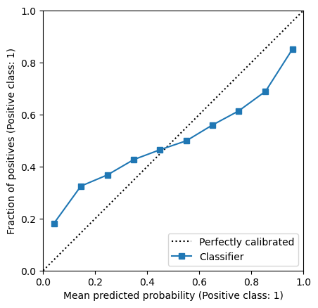
Scikit-learn provide a utility to plot this graphical representation. It is
available through the class sklearn.calibration.CalibrationDisplay.
import matplotlib.pyplot as plt
from sklearn.calibration import CalibrationDisplay

n_bins = 10
disp = CalibrationDisplay.from_predictions(
    y_observed, y_prob, n_bins=n_bins, strategy="uniform"
)
_ = disp.ax_.set(xlim=(0, 1), ylim=(0, 1), aspect="equal")
Exercise:#
As a pedagogical exercise, we will build the calibration curve from scratch. This will help us understand the underlying process. The calibration curve is built by following these steps:
Bin the predicted probabilities (i.e.
y_prob) into 10 bins. You can use thepd.cutfunction from thepandaslibrary. It will return aCategoricalobject where we get the bin identifier for each sample.
import pandas as pd

# TODO
Create a DataFrame with the observed labels, predicted probabilities, and bin identifier.
# TODO
Group the DataFrame by the bin identifier and calculate the mean of the observed labels and the predicted probabilities.
# TODO
Plot the calibration curve by plotting the average predicted probabilities against the fraction of positive samples.
# TODO
Solution:#
As a pedagogical exercise, we will build the calibration curve from scratch. This will help us understand the underlying process. The calibration curve is built by following these steps:
Bin the predicted probabilities (i.e.
y_prob) into 10 bins. You can use thepd.cutfunction from thepandaslibrary. It will return aCategoricalobject where we get the bin identifier for each sample.
import pandas as pd

bin_identifier = pd.cut(y_prob, bins=n_bins)
Create a DataFrame with the observed labels, predicted probabilities, and bin identifier.
predictions = pd.DataFrame(
    {
        "y_observed": y_observed,
        "y_prob": y_prob,
        "bin_identifier": bin_identifier,
    }
)
predictions
| y_observed | y_prob | bin_identifier | |
|---|---|---|---|
| 0 | 0 | 0.013010 | (0.00603, 0.106] |
| 1 | 0 | 0.517491 | (0.5, 0.599] |
| 2 | 1 | 0.738086 | (0.697, 0.796] |
| 3 | 1 | 0.968531 | (0.895, 0.993] |
| 4 | 0 | 0.442157 | (0.401, 0.5] |
| ... | ... | ... | ... |
| 49995 | 1 | 0.980434 | (0.895, 0.993] |
| 49996 | 0 | 0.931823 | (0.895, 0.993] |
| 49997 | 0 | 0.097443 | (0.00603, 0.106] |
| 49998 | 1 | 0.229431 | (0.204, 0.303] |
| 49999 | 0 | 0.362526 | (0.303, 0.401] |
50000 rows × 3 columns
Group the DataFrame by the bin identifier and calculate the mean of the observed labels and the predicted probabilities.
mean_per_bin = predictions.groupby("bin_identifier", observed=True).mean()
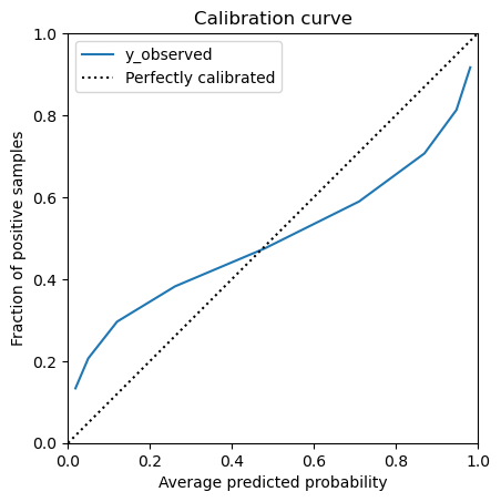
Plot the calibration curve by plotting the average predicted probabilities against the fraction of positive samples.
_, ax = plt.subplots()
mean_per_bin.plot("y_prob", "y_observed", ax=ax)
ax.plot([0, 1], [0, 1], "k:", label="Perfectly calibrated")
ax.legend()
_ = ax.set(
    xlim=(0, 1),
    ylim=(0, 1),
    xlabel="Average predicted probability",
    ylabel="Fraction of positive samples",
    aspect="equal",
    title="Calibration curve",
)
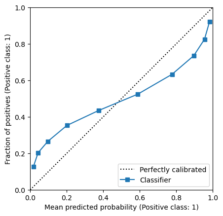
Scikit-learn also provides a parameter strategy that is the strategy to adopt to
create the bins. By default, we used the "uniform" strategy. However, it can happen
that only few samples are present in some bins, leading to a noisy calibration curve.
The strategy "quantile" ensures that each bin has the same number of samples. We
can show it on our previous example:
disp = CalibrationDisplay.from_predictions(
    y_observed, y_prob, n_bins=n_bins, strategy="quantile"
)
_ = disp.ax_.set(xlim=(0, 1), ylim=(0, 1), aspect="equal")
Exercise:#
Modify your previous implementation such that pd.cut uses quantiles to create the
bins instead of the default uniform behaviour. Specifically, look at the bins
parameter in pd.cut and the function np.quantile to compute the quantile from
the predicted probabilities in y_prob to create the bins.
# TODO
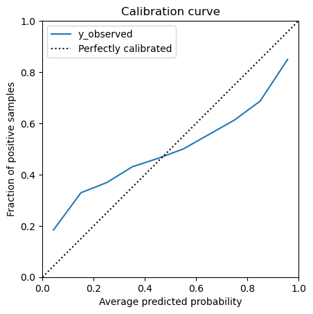
Solution:#
bins = np.quantile(y_prob, np.linspace(0, 1, n_bins))
bin_identifier = pd.cut(y_prob, bins=bins)
predictions = pd.DataFrame(
    {
        "y_observed": y_observed,
        "y_prob": y_prob,
        "bin_identifier": bin_identifier,
    }
)
mean_per_bin = predictions.groupby("bin_identifier", observed=True).mean()
_, ax = plt.subplots()
mean_per_bin.plot("y_prob", "y_observed", ax=ax)
ax.plot([0, 1], [0, 1], "k:", label="Perfectly calibrated")
ax.legend()
_ = ax.set(
    xlim=(0, 1),
    ylim=(0, 1),
    xlabel="Average predicted probability",
    ylabel="Fraction of positive samples",
    aspect="equal",
    title="Calibration curve",
)