Reading calibration curves#
We use different sets of predictions leading to various calibration curves with typical shapes, from which we want to derive insights into the underlying models that generated these predictions, namely:
a well calibrated model;
an overconfident model;
an underconfident model;
a model fit with improper class weights/resampling.
First, let’s gather different prediction sets for the same classification
task. This is achieved using a script named _generate_predictions.py. This
script stores the true labels and the predicted probability estimates of
several models into the predictions folder. We don’t need to understand
what model they correspond to, we just want to analyze the calibration of
these models.
# Make sure to have scikit-learn >= 1.5
import sklearn
sklearn.__version__
'1.9.0'
# Equivalent to the magic command "%run _generate_predictions.py" but it allows this
# file to be executed as a Python script.
from IPython import get_ipython

ipython = get_ipython()
ipython.run_line_magic("run", "../python_files/_generate_predictions.py")
We first load the true testing labels of our problem.
import numpy as np

y_true = np.load("../predictions/y_true.npy")
y_true
array([0, 0, 1, ..., 0, 1, 0], shape=(50000,))
unique_class_labels, counts = np.unique(y_true, return_counts=True)
unique_class_labels
array([0, 1])
counts
array([24886, 25114])
We observe that we have a binary classification problem. Now, we load different sets of predictions of probabilities estimated by different models.
y_proba_1 = np.load("../predictions/y_prob_1.npy")
y_proba_1
array([0.06710903, 0.50699929, 0.60360465, ..., 0.2774031 , 0.37884759,
       0.44355834], shape=(50000,))
We assess the calibration of the model that outputs these predictions by plotting the calibration curve:
data points are first grouped into bins of similar predicted probabilities;
then for each bin, we plot a point of the curve that represents the fraction of observed positive labels in a bin against the mean predicted probability for the positive class in that bin.
import matplotlib.pyplot as plt  # noqa: F401
from sklearn.calibration import CalibrationDisplay
import matplotlib.pyplot as plt

model_predictions = {
    "Well calibrated": y_proba_1,
}


def plot_calibration_curves(y_true, model_predictions):
    _, ax = plt.subplots()
    for model_name, y_proba in model_predictions.items():
        CalibrationDisplay.from_predictions(
            y_true, y_proba, n_bins=10, strategy="quantile", name=model_name, ax=ax
        )
    ax.axvline(0.5, color="gray", linestyle="--")
    ax.set(xlim=(0, 1), ylim=(0, 1), aspect="equal")
    ax.legend(loc="upper left")


plot_calibration_curves(y_true, model_predictions)
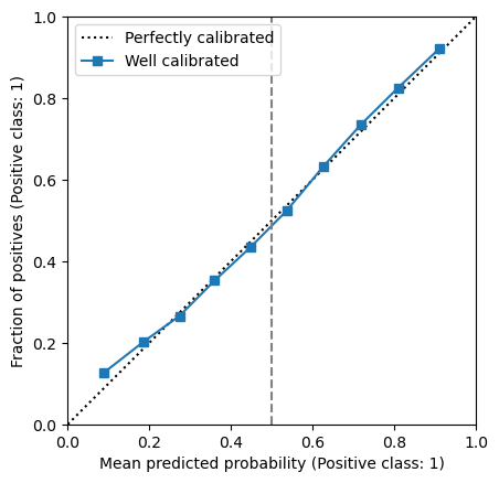
We observe that the calibration curve is close to the diagonal that represents a perfectly calibrated model. It means that relying on the predicted probabilities will provide reliable estimates of the true probabilities.
We now repeat the same analysis for the other sets of predictions.
model_predictions["Overconfident"] = np.load("../predictions/y_prob_2.npy")
plot_calibration_curves(y_true, model_predictions)
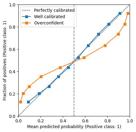
Let’s first focus on the right part of the curve, that is when the models predicts the positive class, assuming a decision threshold at 0.5. The calibration curve is below the diagonal. It means that the fraction of observed positive data points is lower than the predicted probabilities. Therefore, our model over-estimates the probabilities of the positive class when the predictions are higher than the default threshold: the model is therefore overconfident in predicting the positive class.
Let’s now focus on the left part of the curve, that is when the model predicts the negative class. The curve is above the diagonal, meaning that the fraction of observed positive data points is higher than the predicted probabilities of the positive class. This also means that the fraction of observed negatives is lower than the predicted probabilities of the negative class. Therefore, our model is also overconfident in predicting the negative class.
In conclusion, our model is overconfident when predicting either classes: the predicted probabilities are too close to 0 or 1 compared to the observed fraction of positive data points in each bin.
Let’s use the same approach to analyze other typical calibration curves.
model_predictions["Underconfident"] = np.load("../predictions/y_prob_3.npy")
plot_calibration_curves(y_true, model_predictions)
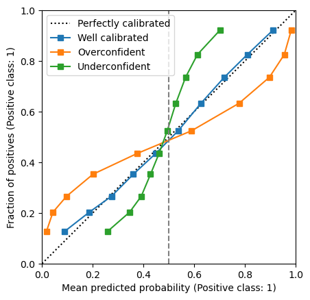
Here, we observe the opposite behaviour compared to the previous case: our model outputs probabilities that are too close to 0.5 compared to the empirical positive class fraction. Therefore, this model is underconfident.
Let’s check the last set of predictions:
model_predictions["Improper class weights"] = np.load("../predictions/y_prob_4.npy")
plot_calibration_curves(y_true, model_predictions)
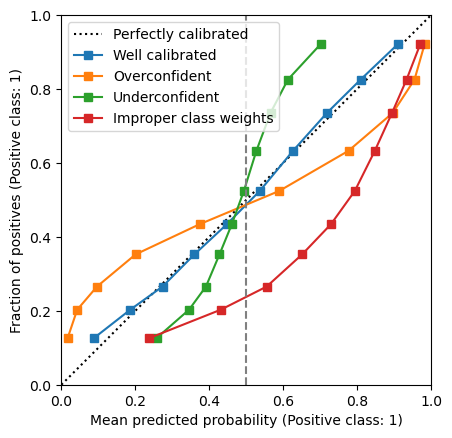
Here, we observe a curve that off the diagonal without ever crossing it. This is another typical case of mis-calibration: in this case the model always over estimates the true probabilities, both below and above the 0.5 threshold. As we will explore in a later notebook, this is a typical behavior of a model trained with improper class weights or resampling strategies.
Finally, let’s also display the ROC curves computed for all those models:
import matplotlib.pyplot as plt
from sklearn.metrics import RocCurveDisplay

fig, axs = plt.subplots(1, 2, figsize=(12, 6))

for model_name, y_proba in model_predictions.items():
    CalibrationDisplay.from_predictions(
        y_true,
        y_proba,
        n_bins=10,
        strategy="quantile",
        name=model_name,
        ax=axs[0],
    )
    roc_display = RocCurveDisplay.from_predictions(
        y_true, y_proba, name=model_name, ax=axs[1]
    )

axs[0].legend(loc="upper left")
_ = axs[0].set(title="Calibration curves", xlim=(0, 1), ylim=(0, 1), aspect="equal")
_ = axs[1].set(title="Receiver operator curves", aspect="equal")
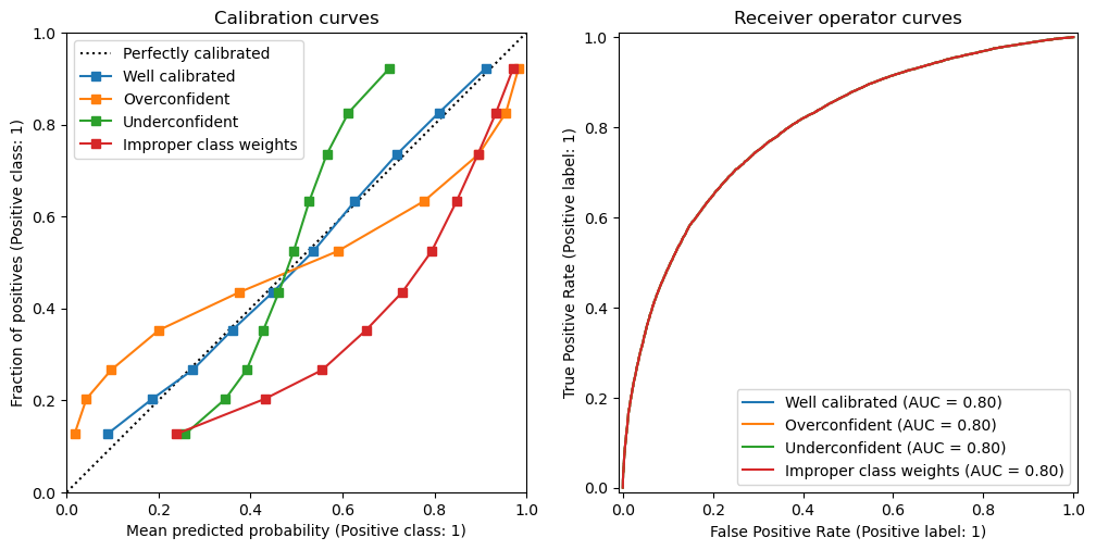
We observe that the all the ROC curves overlap exactly and as a result the ROC AUC values are exactly the same. This means that all those predictions have the same ability to discriminate between the two classes, also known as “ranking power” or “resolution”. The models predictions only differ in their calibration.
This highlights the fact that ROC curves and ranking metrics such as ROC AUC and average precision are blind to the calibration of probabilistic models. On the contrary, metrics such as log loss or Brier score are sensitive to both the calibration and the ranking power of the models:
import pandas as pd
from sklearn.metrics import (
    log_loss,
    brier_score_loss,
    roc_auc_score,
    average_precision_score,
)

model_scores = []
for model_name, y_proba in model_predictions.items():
    model_scores.append(
        {
            "Model": model_name,
            "Log-loss": log_loss(y_true, y_proba),
            "Brier score": brier_score_loss(y_true, y_proba),
            "ROC AUC": roc_auc_score(y_true, y_proba),
            "Average Precision": average_precision_score(y_true, y_proba),
        }
    )
pd.DataFrame(model_scores).set_index("Model").round(3)
| Log-loss | Brier score | ROC AUC | Average Precision | |
|---|---|---|---|---|
| Model | ||||
| Well calibrated | 0.546 | 0.183 | 0.799 | 0.802 |
| Overconfident | 0.631 | 0.199 | 0.799 | 0.802 |
| Underconfident | 0.594 | 0.202 | 0.799 | 0.802 |
| Improper class weights | 0.667 | 0.232 | 0.799 | 0.802 |